I’ve seen clients find the UI design of the menu confusing when items have subitems:
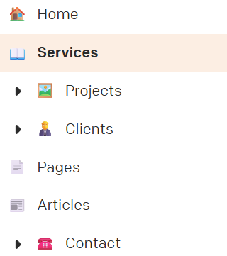
The current UI design puts a “dropdown arrow” on the left of the menu item. Visually, this:
- Makes it seem like that item is itself already a sub-item of the item above
- Makes it seem like that item is not a “real” item but merely a group that opens to reveal real items (e.g. I’ve seen clients say “how do I get to Projects” when the Projects item is right there, because they assume that the “Projects” menu item isnt itself live but only reveals more options beneath).
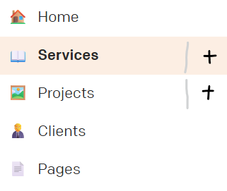
There is a simple UI adjustment that would fix this.
Instead of arrows to the left, use a plus/minus to the right. Not able to mock that up perfectly right now, but something more like: