Hi,
I’m using react-datocms <Image /> component like this.
<div className="relative h-[200px] w-[200px] sm:h-[273px] sm:w-[273px]">
          <DatoImage
            data={badgeImage}
            layout="fill"
            srcSetCandidates={[0.75, 1]}
            sizes="(min-width: 640px) 273px, 200px"
          />
</div>
From the container’s CSS properties, it is clear that there are only 2 possible widths for the image:
-
On smaller screens, the image will be 200px wide
-
On screen sizes bigger than 640px (tailwind variant ‘sm’) , the image will be 273px wide
That’s why, I have declared (min-width: 640px) 273px, 200px in the sizes prop.
And because I’ve validation on image on DatoCMS side that image can only be 273px wide - so, I have declared srcSetCandidates to avoid generation of unnecessary image sizes.
I just loaded this page on a 518px wide screen size and the generated source is:
<source srcset="https://www.datocms-assets.com/img-name.png?auto=format&dpr=0.75 204w,https://www.datocms-assets.com/img-name.png?auto=format 273w" sizes="(min-width: 640px) 273px, 200px">
** I copied this from browser’s inspect elements pane. Though, I changed the image name here to make it more readable.
We can see that it generated 2 images:
-
First one is dpr=0.75 & 204w. (Image width: 204px)
-
Second one is the original image (Image width: 273px)
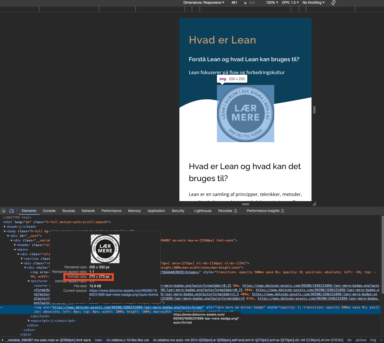
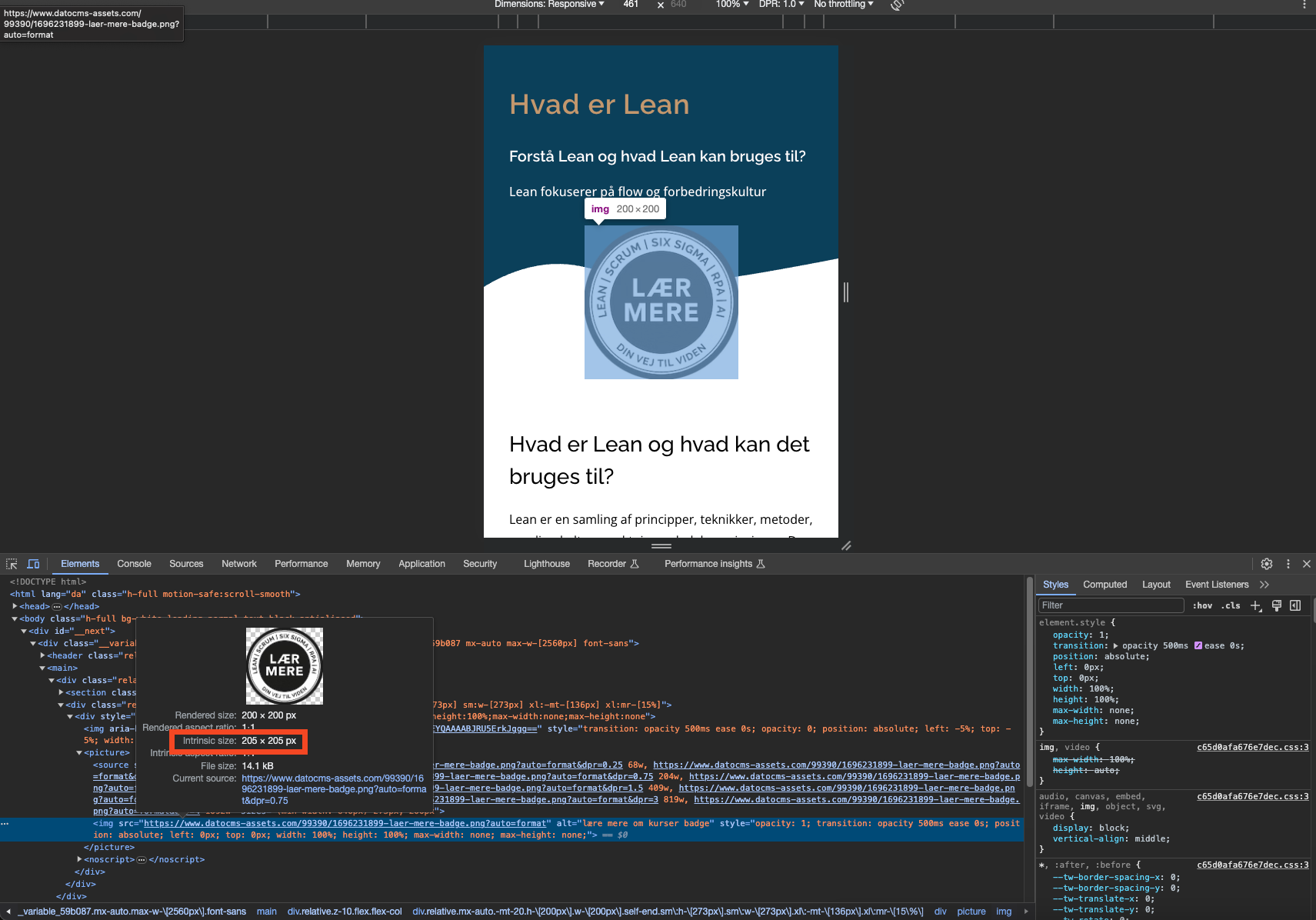
And when I hover over the src of <img /> rendered in the inspect elements, I see this.
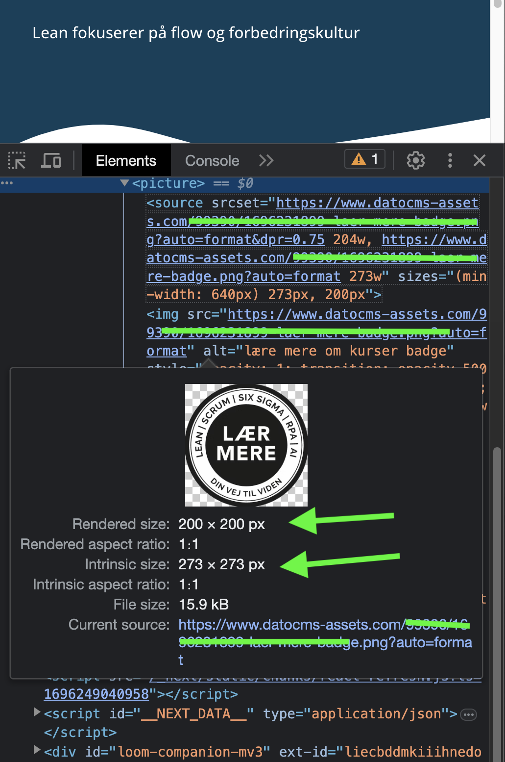
You can see that:
Rendered size: 200 * 200px
Intrinsic size: 273 * 273px
Current Source: The original image (This should have been that 204w image)
it is clear that browser is loading 273px wide image even on screens smaller than 640px width.
So, can you please guide me why it is not loading that first image i.e. 204px wide image that is inside the source?
Thanks!!!