I was trying to bundle a number of actions that could be taken on a field based on its contents using a dropdown field to select the action, then another smaller button to execute it. However, the dropdown field seems to be stuck in the iframe and clicking on the dropdown causes some pretty ugly UX.
From my testing, it seems like the dropdown button is pretty much useless in a field extension. Am I missing something for how the dropdown should be configured for this use case?
Yeah, i’ll see if I can put together a generic example. But, a simple extreme case would be a basic field extension plugin with a dropdown field just below the field it is associated with, but with 50 items in the dropdown.
When I use a dropdown in a field extension, it seems like the dropdown is stuck within the iframe, so it doesn’t behave like the native dropdowns anywhere else on the form.
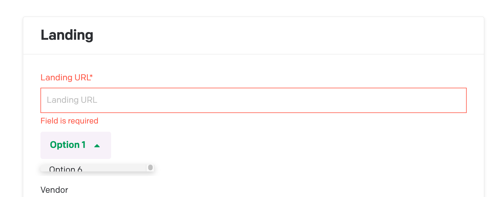
This is just a simple field extension with a dropdown. I built a component that if you pass it a number of options you want, it dynamically generates them for you. Here it is as the only child to the Canvas element as-is. Because it is in an iframe, it can’t overlay the fields just below. It expands a minimum amount, which causes the iframe to expand a little bit.
My core question here is, is the behavior shown in the video/screenshot above expected? I assume there isn’t a way for it to work outside the iframe, so to me it seems like it would be useless in a field extension. I supposed I could add some styling on the dropdown to force its minimum height, but still the UX for that would be kind of janky.
Code
This component might not make complete sense as-is, but it is just a quick adaption of what I was going for. The idea being I could have one or more actions registered to a field. If there is more than 1, then it uses the dropdown component (the original idea was to add a button next to the dropdown to execute the selected option, but excluded that here to avoid additional styling).
I just made it so it outputs a bunch of options in the dropdown menu. This dropdown is placed as a child of a Canvas component, where I followed this example to import the styles as suggested.
import React, { useState } from 'react';
import {
  Button,
  Dropdown,
  DropdownOption,
  DropdownMenu,
  CaretUpIcon,
  CaretDownIcon,
} from 'datocms-react-ui';

// Define a type for the option structure expected in the dropdown
interface IDropdownOption {
  id: string;
  text: string;
}

// Props type definition for the component
interface IDropdownProps {
  numberOfOptions: number; // The N number of options to display
}

const SimpleDropdown: React.FC<IDropdownProps> = ({ numberOfOptions }) => {
  // Generate an array of options based on the numberOfOptions prop
  const options: IDropdownOption[] = Array.from({ length: numberOfOptions }, (_, index) => ({
    id: `option-${index + 1}`,
    text: `Option ${index + 1}`,
  }));

  const [selectedOption, setSelectedOption] = useState<IDropdownOption>(options[0]);

  const handleChange = (option: IDropdownOption) => {
    setSelectedOption(option);
  };

  return (
    <div>
      {options.length > 1 && (
        <Dropdown
          renderTrigger={({ open, onClick }) => (
            <Button
              onClick={onClick}
              rightIcon={open ? <CaretUpIcon /> : <CaretDownIcon />}
            >
              {selectedOption.text} {/* Reflecting the selected option text */}
            </Button>
          )}
        >
          <DropdownMenu>
            {options.map((option) => (
              <DropdownOption
                key={option.id}
                onClick={() => handleChange(option)}
              >
                {option.text}
              </DropdownOption>
            ))}
          </DropdownMenu>
        </Dropdown>
      )}
    </div>
  );
};

export default SimpleDropdown;
My apologies again for the delay on this. We’ll work on better tracking for forum posts across categories.
This seems like a bug/oversight to me, because the autoresizer isn’t properly accounting for the dynamic height of the dropdown. And it should probably be an overlay instead of an inline iframe, I’m guessing. Unfortunately, this behavior seems to be hardcoded into our datocms-react-ui plugin design system and will require some changes on our side. I’ll report it to the devs right away.
In the meantime, here is a workaround that might be better than nothing…
Demo video
Implementation
First I modified the <Dropdown/> element to manually resize the iframe:
<Dropdown
    renderTrigger={({open, onClick}) => (
        <Button
            onClick={() => {
                ctx.stopAutoResizer() // If we don't stop it, the autosizer will keep fighting us
                ctx.setHeight(300).then(() => onClick()) // The height determines how many options are shown at once
            }}
            rightIcon={open ? <CaretUpIcon/> : <CaretDownIcon/>}
        >
            {selectedOption.text} {/* Reflecting the selected option text */}
        </Button>
    )}
>
Then I also changed the handleChange handler to resume autoresize after a selection has been made:
const handleChange = (option: IDropdownOption) => {
    setSelectedOption(option);
    ctx.startAutoResizer(); // Shrink it back down on selection
};
You can see the whole file here:
I know it’s kinda hacky, but I think a cleaner fix would require upstream changes from us I’ll let the devs know and report back as soon as I can.
 I’ll let the devs know and report back as soon as I can.