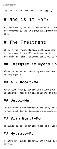
In working with editors over the years, I’ve realised that Markdown is not quite as user-friendly as we developers like to believe.
I think improved display of Markdown headings would go a long way, as these cause the most confusion (editors are often not sure whether the pound signs will appear on their website). It could be as simple as showing the pound signs in light grey so they don’t draw attention, or setting them right-aligned outside the text box as do some other Markdown editors.
