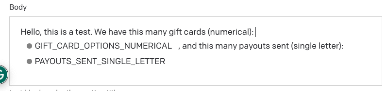
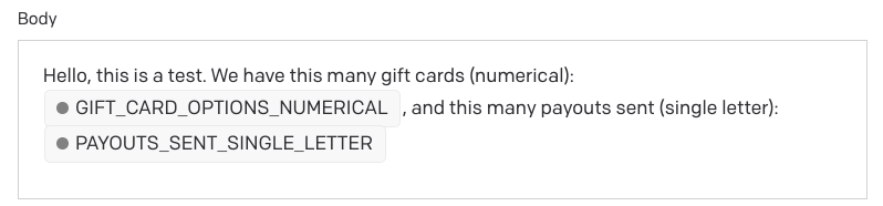
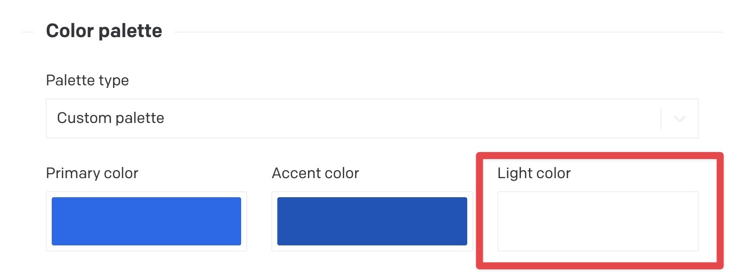
One of our devs had a chance to look into this, and just so you know, those backgrounds are missing because you set your project theme’s “Light Color” to pure white (#FFFFFF), which makes those highlights (and other UI elements) invisible against the standard white background.
Our dev will look into whether there’s any easy CSS fix they can apply to this, but in the meantime, a simple workaround would be to just set your defined Light Color to something slightly off-white (i.e. light gray, or very light blue if you want to maintain the same hues).
Just letting you know. Thanks again for the report!